

Instructions
Webflow template user guide.
GSAP Guide
Every GSAP code used on this template is here. How to edit them and find them is explain on this page. In every code block on this page, we added additional explanation to help you understand everything.
You can find the code in (Site settings) Footer Code.
You can find the code in (Site settings) Footer Code.
Draggable Infinity Marquee
A seamless horizontal marquee interaction powered by GSAP, featuring infinite auto-scrolling, draggable controls, inertia momentum, and hover pause functionality. This component creates a more dynamic and premium user experience compared to standard marquee animations, making it ideal for showcasing logos, services, portfolios, or featured content.
To use this interaction, make sure GSAP, Draggable, and InertiaPlugin are properly loaded before the closing </body> tag. The marquee container must use the attribute [wb-data="marquee"], while the scrolling content should be wrapped inside a single .marquee-content element. The duration attribute controls the scrolling speed, and all marquee items should remain in a single horizontal row for a seamless infinite loop effect.
To use this interaction, make sure GSAP, Draggable, and InertiaPlugin are properly loaded before the closing </body> tag. The marquee container must use the attribute [wb-data="marquee"], while the scrolling content should be wrapped inside a single .marquee-content element. The duration attribute controls the scrolling speed, and all marquee items should remain in a single horizontal row for a seamless infinite loop effect.
<script>
  gsap.registerPlugin(Draggable, InertiaPlugin);

  document.addEventListener('DOMContentLoaded', () => {
    const marquee = document.querySelector('[wb-data="marquee"]');
    if (!marquee) return;

    const duration = parseInt(marquee.getAttribute('duration'), 20) || 5;
    const marqueeContent = marquee.firstChild;
    if (!marqueeContent) return;

    // Clone for seamless loop
    const marqueeContentClone = marqueeContent.cloneNode(true);
    marquee.append(marqueeContentClone);

    marquee.style.cursor = 'grab';

    let tween;
    let distanceToTranslate;
    let isDragging = false; // guard flag so click-after-drag doesn't hit the accordion
    let activeTl = null; // NEW: moved up — the currently open accordion timeline, shared with Draggable below

    const playMarquee = () => {
      let progress = tween ? tween.progress() : 0;
      tween && tween.progress(0).kill();

      const width = parseInt(getComputedStyle(marqueeContent).getPropertyValue('width'), 10);
      const gap = parseInt(getComputedStyle(marqueeContent).getPropertyValue('column-gap'), 10);
      distanceToTranslate = -1 * (gap + width);

      tween = gsap.fromTo(marquee.children, { x: 0 }, { x: distanceToTranslate, duration, ease: 'none', repeat: -1 });
      tween.progress(progress);
    };

    playMarquee();

    // ---- PAUSE ON HOVER ----
    marquee.addEventListener('mouseenter', () => {
      if (tween) gsap.to(tween, { timeScale: 0, duration: 0.3 });
    });
    marquee.addEventListener('mouseleave', () => {
      if (tween) gsap.to(tween, { timeScale: 1, duration: 0.3 });
    });

    // ---- DRAGGABLE ----
    const proxy = document.createElement('div');
    let startProgress = 0;

    Draggable.create(proxy, {
      type: 'x',
      trigger: marquee,
      inertia: true,
      onPressInit() {
        gsap.killTweensOf(tween);
        tween.timeScale(0);
        marquee.style.cursor = 'grabbing';
        startProgress = tween.progress();
        gsap.set(proxy, { x: 0 });

        gsap.to('.item-horizon-block', { scale: 0.95, duration: 0.2 });
      },
      onDragStart() {
        isDragging = true; // real drag confirmed, block the upcoming click

        // NEW: close whichever accordion card is currently open.
        // A card that stays "active" while the row scrolls just clips in/out
        // of the visible viewport and looks buggy — closing it here avoids that.
        if (activeTl) {
          activeTl.reverse();
          activeTl = null;
        }
      },
      onDrag() {
        const progressDelta = this.x / distanceToTranslate;
        let newProgress = startProgress + progressDelta;
        newProgress = ((newProgress % 1) + 1) % 1;
        tween.progress(newProgress);
      },
      onThrowUpdate() {
        const progressDelta = this.x / distanceToTranslate;
        let newProgress = startProgress + progressDelta;
        newProgress = ((newProgress % 1) + 1) % 1;
        tween.progress(newProgress);
      },
      onRelease() {
        marquee.style.cursor = 'grab';
        gsap.to('.item-horizon-block', { scale: 1, duration: 0.3 });

        // NEW: release the guard AFTER the native click event has already
        // fired and been ignored, so the next genuine tap works normally
        requestAnimationFrame(() => {
          isDragging = false;
        });
      },
      onThrowComplete() {
        const isHovering = marquee.matches(':hover');
        gsap.to(tween, { timeScale: isHovering ? 0 : 1, duration: 0.3 });
      },
    });

    // ---- DEBOUNCED RESIZE ----
    function debounce(func) {
      var timer;
      return function (event) {
        if (timer) clearTimeout(timer);
        timer = setTimeout(() => func(), 500, event);
      };
    }
    window.addEventListener('resize', debounce(playMarquee));

    // ---- ACCORDION (mobile / tablet only) ----
    if (!window.matchMedia('(max-width: 991px)').matches) return;

    // Query AFTER the clone has been appended above, so cloned cards get listeners too
    const items = document.querySelectorAll('.collection-item-work');
    // activeTl already declared above (shared with the Draggable's onDragStart)

    items.forEach((item) => {
      const wrapper = item.querySelector('.wrapper-info-work');
      if (!wrapper) return;

      const title = wrapper.querySelector('.title-name-work');
      const block = wrapper.querySelector('.block-info-works');
      const horizon = item.querySelector('.horizon-blocker');

      if (!title || !block || !horizon) return;

      const tl = gsap.timeline({ paused: true });

      tl.fromTo(wrapper, { height: '0%' }, { height: '100%', duration: 0.5, ease: 'power1.out' }, 0);
      tl.fromTo([title, block], { opacity: 0, y: '3vw' }, { opacity: 1, y: '0vw', duration: 0.75, ease: 'power1.out' }, 0);
      tl.to(horizon, { y: '100%', duration: 0.5, ease: 'power1.out' }, 0);

      item.addEventListener('click', (e) => {
        if (isDragging) {
          e.preventDefault(); // click was actually a drag/throw release — ignore entirely
          return;
        }

        const isAlreadyActive = activeTl === tl;

        if (isAlreadyActive) {
          // Card is already open → don't replay the animation,
          // let the click go through so the link navigates normally.
          return;
        }

        // First click on this card: open it, and don't navigate yet.
        e.preventDefault();

        if (activeTl) {
          activeTl.reverse();
        }

        tl.play(0);
        activeTl = tl;
      });
    });
  });
</script>
Mouse Move 3D Interaction
This interaction creates a subtle 3D floating effect that responds to the user’s mouse movement, adding depth and a more immersive visual experience to the interface. Using GSAP animation, the element smoothly translates and rotates based on cursor position, making it ideal for featured images, CTA sections, or hero visuals.
To use this effect, assign the class .center-img-cta to the target element and ensure GSAP is properly loaded before the closing </body> tag. The interaction automatically tracks mouse movement across the viewport and applies smooth transform animations with perspective enabled for a modern 3D motion effect.
To use this effect, assign the class .center-img-cta to the target element and ensure GSAP is properly loaded before the closing </body> tag. The interaction automatically tracks mouse movement across the viewport and applies smooth transform animations with perspective enabled for a modern 3D motion effect.
<script>
  const item = document.querySelector('.center-img-cta');
  if (item) {
    window.addEventListener('mousemove', (e) => {
      const x = e.clientX / window.innerWidth - 0.5;
      const y = e.clientY / window.innerHeight - 0.5;
      gsap.to(item, { x: x * 20, y: y * 20, rotationY: x * 10, rotationX: y * -10, duration: 0.6, ease: 'power2.out', transformPerspective: 1200, transformOrigin: 'center center', overwrite: true });
    });
  }
</script>
Smart Navbar Scroll Visibility
This interaction creates an auto-hide navigation behavior that improves focus and browsing experience by hiding the navbar while scrolling down and revealing it again when scrolling up. The system also intelligently keeps the navbar visible while the menu is open, creating a smoother and more user-friendly mobile navigation experience.
To use this interaction, assign the class .wrapper-navbar to the navbar container, .hamburger-button-link to the menu toggle button, and .bg-menu-blur to the menu overlay background. GSAP and ScrollTrigger must be loaded before the closing </body> tag. The script is optimized for Webflow using window.Webflow.push() to ensure animations initialize correctly after Webflow and GSAP are fully loaded.
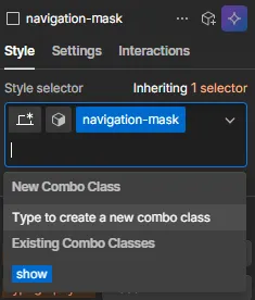
To edit the navigation visibility in designer mode, please apply the combo class .show to the navigation-mask div block inside navbar-item-wrap. This combo class is used to control the active state and visibility behavior of the navigation menu within Webflow.
To use this interaction, assign the class .wrapper-navbar to the navbar container, .hamburger-button-link to the menu toggle button, and .bg-menu-blur to the menu overlay background. GSAP and ScrollTrigger must be loaded before the closing </body> tag. The script is optimized for Webflow using window.Webflow.push() to ensure animations initialize correctly after Webflow and GSAP are fully loaded.
To edit the navigation visibility in designer mode, please apply the combo class .show to the navigation-mask div block inside navbar-item-wrap. This combo class is used to control the active state and visibility behavior of the navigation menu within Webflow.
<script>
  /**
   * Navbar Show/Hide on Scroll
   * ─────────────────────────────────────────────────────────────────────────────
   * Marketplace-safe. Uses window.Webflow.push() to wait for GSAP — the
   * official Webflow method, no polling or retry loops needed.
   *
   * Place in: Page Settings → Before </body>
   * ─────────────────────────────────────────────────────────────────────────────
   */
  (function initNavbarScroll() {
    // ── Selectors ──
    var SEL_NAVBAR = '.wrapper-navbar';
    var SEL_TOGGLE = '.hamburger-button-link'; // Hamburger — opens and closes menu
    var SEL_BLUR = '.bg-menu-blur'; // Blur overlay — closes on click

    // ── Animation config ──
    var HIDE_Y = -102; // yPercent when hidden (-102 also hides box-shadow)
    var DUR_HIDE = 0.5;
    var DUR_SHOW = 0.5;
    var DUR_SNAP = 0.3; // Fast snap when menu opens

    // ── Internal state ──
    var menuOpen = false;
    var scrollInstance = null;

    function init() {
      var _gsap = window.gsap;
      var _ScrollTrigger = window.ScrollTrigger;

      // Guard: abort if GSAP or ScrollTrigger unavailable
      if (!_gsap || !_ScrollTrigger) return;

      var navbar = document.querySelector(SEL_NAVBAR);
      var toggleBtn = document.querySelector(SEL_TOGGLE);
      var blurEl = document.querySelector(SEL_BLUR);

      // Abort silently if navbar not on this page
      if (!navbar) return;

      // ── Animation helpers ──

      function showNavbar(dur) {
        _gsap.killTweensOf(navbar);
        _gsap.to(navbar, {
          yPercent: 0,
          duration: dur != null ? dur : DUR_SHOW,
          ease: 'power1.out',
          overwrite: true,
        });
      }

      function hideNavbar() {
        _gsap.to(navbar, {
          yPercent: HIDE_Y,
          duration: DUR_HIDE,
          ease: 'power1.inOut',
          overwrite: 'auto',
        });
      }

      // ── Menu state handlers ──

      function openMenu() {
        if (menuOpen) return;
        menuOpen = true;
        if (scrollInstance) scrollInstance.disable();
        showNavbar(DUR_SNAP);
      }

      function closeMenu() {
        if (!menuOpen) return;
        menuOpen = false;
        if (scrollInstance) scrollInstance.enable();
      }

      function toggleMenu() {
        menuOpen ? closeMenu() : openMenu();
      }

      // Register ScrollTrigger into Webflow's GSAP instance
      _gsap.registerPlugin(_ScrollTrigger);

      // ── ScrollTrigger: hide on scroll down, show on scroll up ──
      scrollInstance = _ScrollTrigger.create({
        start: 'top top',
        end: 'max',
        onUpdate: function (self) {
          if (menuOpen) return; // Suspended while menu is open
          self.direction === 1 ? hideNavbar() : showNavbar();
        },
      });

      // ── Bind all close/open triggers ──
      if (toggleBtn) toggleBtn.addEventListener('click', toggleMenu);
      if (blurEl) blurEl.addEventListener('click', closeMenu);

      // Escape key as additional close trigger
      document.addEventListener('keydown', function (e) {
        if (e.key === 'Escape' && menuOpen) closeMenu();
      });
    } // end init()

    // ── Use Webflow.push() — official way to run code after Webflow + GSAP ready ──
    window.Webflow = window.Webflow || [];
    window.Webflow.push(init);
  })();
</script>
Interactive Founder Card Stack
This interaction creates an animated stacked card system where cards smoothly cycle forward when clicked, simulating a dynamic deck transition effect. Each card animates with layered movement, scaling, depth, and momentum-based motion to create a more engaging and premium storytelling experience for founder profiles, testimonials, or featured content sections.
To use this interaction, apply the class .card-founder to all stack items and ensure GSAP is loaded before the closing </body> tag. The script automatically handles card positioning, stacking order, scaling, and transition animations. Each card becomes clickable and will smoothly move to the back of the stack while the remaining cards shift forward dynamically.
To use this interaction, apply the class .card-founder to all stack items and ensure GSAP is loaded before the closing </body> tag. The script automatically handles card positioning, stacking order, scaling, and transition animations. Each card becomes clickable and will smoothly move to the back of the stack while the remaining cards shift forward dynamically.
<script>
  const cards = gsap.utils.toArray('.card-founder');
  let current = 0;
  let activeTl = null;

  function initStack() {
    const total = cards.length;
    cards.forEach((card, i) => {
      gsap.set(card, {
        zIndex: total - i,
        x: i * 60,
        y: 0,
        scale: 1 - i * 0.07,
        rotation: 0,
        opacity: 1,
      });
    });
  }

  function advanceStack() {
    // If an animation is running, snap it to completion before starting the next
    if (activeTl && activeTl.isActive()) {
      activeTl.progress(1);
    }

    const total = cards.length;
    const topCard = cards[current];

    activeTl = gsap.timeline({
      onComplete: () => {
        current = (current + 1) % total;
      },
    });

    // 1. Pull back
    activeTl.to(topCard, {
      x: '-=30',
      scale: 0.92,
      duration: 0.2,
      ease: 'power2.in',
    });

    // 2. Throw to the left — smooth with momentum
    activeTl.to(
      topCard,
      {
        x: -500,
        autoAlpha: 0,
        rotation: -10,
        zIndex: total + 1,
        duration: 0.5,
        ease: 'expo.inOut',
      },
      '-=0.05',
    );

    // 3. Cards behind move forward
    cards.forEach((card, i) => {
      if (card === topCard) return;
      const pos = (i - current - 1 + total) % total;
      activeTl.to(
        card,
        {
          zIndex: total - pos,
          x: pos * 60,
          y: 0,
          scale: 1 - pos * 0.07,
          opacity: 1,
          rotation: 0,
          duration: 0.45,
          ease: 'power3.out',
        },
        '-=0.3',
      );
    });

    // 4. Teleport to back position — invisible, slightly below
    activeTl.call(() => {
      gsap.set(topCard, {
        x: (total - 1) * 60,
        y: 40,
        rotation: -6,
        scale: 1 - (total - 1) * 0.07,
        zIndex: 1,
        autoAlpha: 0,
      });
    });

    // 5. Animate into back stack position — smooth, no flicker
    activeTl.to(
      topCard,
      {
        y: 0,
        rotation: 0,
        autoAlpha: 1,
        duration: 0.35,
        ease: 'power2.out',
      },
      '+=0.05',
    );
  }

  initStack();
  document
    .querySelectorAll('.card-founder, .cursor-founder')
    .forEach((c) => c.addEventListener('click', advanceStack));
  );
</script>
Custom Cursor Follow Interaction
This interaction creates a smooth custom cursor follower that replaces the native cursor inside the founder testimonial section. Using GSAP quick setters, the follower smoothly tracks mouse movement with improved performance and responsiveness, creating a more immersive and premium interaction experience for interactive card layouts.
To use this interaction, assign the class .wrapper-content-founder to the main trigger area, .cursor-founder to the custom cursor element, and .card-founder to each interactive card item. GSAP must be loaded before the closing </body> tag. The script automatically hides the default cursor within the section and smoothly reveals the custom follower when users enter the interaction area.
To use this interaction, assign the class .wrapper-content-founder to the main trigger area, .cursor-founder to the custom cursor element, and .card-founder to each interactive card item. GSAP must be loaded before the closing </body> tag. The script automatically hides the default cursor within the section and smoothly reveals the custom follower when users enter the interaction area.
<script>
  //testimonial cursor founder
  document.addEventListener('DOMContentLoaded', function () {
    const triggerWrap = document.querySelector('.wrapper-content-founder');
    const cursorFollow = document.querySelector('.cursor-founder');
    const triggers = document.querySelectorAll('.card-founder');

    if (!triggerWrap || !cursorFollow) return;

    // Initial setup: hide the follower and position it absolutely
    gsap.set(cursorFollow, {
      position: 'fixed',
      top: -200,
      left: -80,
      xPercent: -50,
      yPercent: -50,
      scale: 0,
      opacity: 0,
      pointerEvents: 'none',
      zIndex: 9999,
    });

    // Quick setters for performance (much smoother than gsap.to on every mousemove)
    const xTo = gsap.quickTo(cursorFollow, 'x', { duration: 0.4, ease: 'power3.out' });
    const yTo = gsap.quickTo(cursorFollow, 'y', { duration: 0.4, ease: 'power3.out' });

    // Track mouse position globally so the follower keeps up smoothly
    window.addEventListener('mousemove', (e) => {
      xTo(e.clientX);
      yTo(e.clientY);
    });

    // Show follower when entering the wrap, hide native cursor on triggers
    triggerWrap.addEventListener('mouseenter', () => {
      gsap.to(cursorFollow, {
        scale: 1,
        opacity: 1,
        duration: 0.3,
        ease: 'power2.out',
      });
    });

    triggerWrap.addEventListener('mouseleave', () => {
      gsap.to(cursorFollow, {
        scale: 0,
        opacity: 0,
        duration: 0.3,
        ease: 'power2.in',
      });
    });

    // Hide the native cursor on the trigger children for the "replacing" effect
    triggers.forEach((trigger) => {
      trigger.style.cursor = 'none';
    });
    triggerWrap.style.cursor = 'none';
  });
</script>
Countdown Numberic
Here is a script code for several numeric text elements that can automatically perform a countdown.
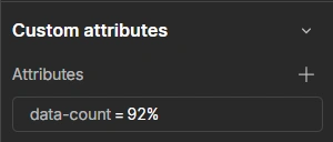
However, please pay attention to how this script is used to ensure it runs properly. You need to add a custom attribute to the text element or div block you are using. Add the following:
* Name = "data-count"
* Value = "(the number you want)"
However, please pay attention to how this script is used to ensure it runs properly. You need to add a custom attribute to the text element or div block you are using. Add the following:
* Name = "data-count"
* Value = "(the number you want)"
<script>
gsap.registerPlugin(ScrollTrigger);

document.querySelectorAll("[data-count]").forEach((el) => {

  const finalValue = el.getAttribute("data-count");

  const number = parseInt(finalValue.replace(/\D/g, ""));

  const suffix = finalValue.replace(/[0-9]/g, "");

  let obj = { value: 0 };

  gsap.to(obj, {
    value: number,
    duration: 2,
    ease: "power2.out",

    onUpdate: () => {
      el.textContent =
        Math.floor(obj.value) + suffix;
    },

    scrollTrigger: {
      trigger: el,
      start: "top 85%",
      once: true
    }
  });

});
</script>
Analog & Digital Clock Animation
This interaction combines an animated analog clock with a live digital clock display to create a modern real-time timekeeping component for hero sections or interface highlights. The analog clock smoothly updates the rotation of the hour and minute needles using GSAP, while the digital clock features a blinking separator animation for a clean and dynamic visual effect.
To use this interaction, assign the classes .analog-clock, .long-needle, and .short-needle to the analog clock elements, and .hour, .minute, and .colon to the digital clock components. GSAP must be loaded before the closing </body> tag. The script automatically updates the current time in real-time and continuously animates both clock systems for a seamless live clock experience.
To use this interaction, assign the classes .analog-clock, .long-needle, and .short-needle to the analog clock elements, and .hour, .minute, and .colon to the digital clock components. GSAP must be loaded before the closing </body> tag. The script automatically updates the current time in real-time and continuously animates both clock systems for a seamless live clock experience.
<script>
  // Only run on pages that have the analog clock
  if (document.querySelector('.analog-clock')) {
    function updateClock() {
      const now = new Date();
      const minuteAngle = now.getMinutes() * 6 + now.getSeconds() * 0.1;
      const hourAngle = (now.getHours() % 12) * 30 + now.getMinutes() * 0.5;

      gsap.set('.long-needle', { rotation: minuteAngle });
      gsap.set('.short-needle', { rotation: hourAngle });
    }

    updateClock();
    gsap.ticker.add(updateClock);
  }
</script>

<!--HERO DIGITAL CLOCK GSAP-->
<script>
  const hourEl = document.querySelector('.hour');
  const minuteEl = document.querySelector('.minute');
  const colonEl = document.querySelector('.colon');

  // Bail out if the clock isn't on this page
  if (hourEl && minuteEl && colonEl) {
    function updateTime() {
      const now = new Date();
      const hours = now.getHours();
      const minutes = now.getMinutes();
      hourEl.textContent = String(hours).padStart(2, '0');
      minuteEl.textContent = String(minutes).padStart(2, '0');
    }
    updateTime();
    setInterval(updateTime, 1000 * 10);

    if (typeof gsap !== 'undefined') {
      gsap.to(colonEl, {
        opacity: 0,
        duration: 0.6,
        ease: 'power1.inOut',
        repeat: -1,
        yoyo: true,
      });
    }
  }
</script>
<!--END HERO DIGITAL CLOCK GSAP-->
Hero Image Trail Effect
This interaction creates a dynamic image trail animation that follows the user’s cursor or touch movement across the screen, generating a fluid and immersive visual experience. Images smoothly appear, scale, and fade with layered motion effects, making the interaction ideal for creative hero sections, portfolios, or modern interactive layouts.
To use this interaction, assign the class .image-wrap to the main container and .content-img-wrap to each trail image element. GSAP must be loaded before the closing </body> tag. The script supports both mouse and touch interactions, automatically triggering image animations based on movement distance to create a smooth and responsive trail effect across desktop and mobile devices.
To use this interaction, assign the class .image-wrap to the main container and .content-img-wrap to each trail image element. GSAP must be loaded before the closing </body> tag. The script supports both mouse and touch interactions, automatically triggering image animations based on movement distance to create a smooth and responsive trail effect across desktop and mobile devices.
<script>
  // Hero Image Trail Effect
  document.addEventListener('DOMContentLoaded', () => {
    // --- ELEMENTS & INITIAL SETUP ---
    // Using querySelector (bring back null if not found)
    const wrapper = document.querySelector('.image-wrap');
    //if (!wrapper) return console.error('Missing .image-wrap container');
    if (!wrapper) return;

    const images = gsap.utils.toArray('.content-img-wrap');
    // VALIDATION: Stop if there is no image
    if (images.length === 0) return console.error('No .content-img-wrap elements found');

    let mouse = { x: window.innerWidth / 2, y: window.innerHeight / 2 };
    let last = { x: mouse.x, y: mouse.y };
    let cache = { x: mouse.x, y: mouse.y };
    let index = 0;
    let threshold = 80;
    let activeImages = 0;
    let idle = true;

    // --- MOUSE MOVEMENT TRACKING ---
    window.addEventListener('mousemove', (e) => {
      mouse.x = e.clientX;
      mouse.y = e.clientY;
    });

    // --- GSAP TICKER LOOP ---
    gsap.ticker.add(() => {
      // Smooth follow (lerp effect)
      cache.x = gsap.utils.interpolate(cache.x, mouse.x, 0.1);
      cache.y = gsap.utils.interpolate(cache.y, mouse.y, 0.1);

      // Distance check
      const dist = Math.hypot(mouse.x - last.x, mouse.y - last.y);

      if (dist > threshold) {
        showNextImage();
        last.x = mouse.x;
        last.y = mouse.y;
      }

      // Reset index when idle
      if (idle && index !== 1) index = 1;
    });

    // --- SHOW NEXT IMAGE FUNCTION ---
    function showNextImage() {
      index++;
      const img = images[index % images.length];

      // Double check
      if (!img) return;

      const rect = img.getBoundingClientRect();

      gsap.killTweensOf(img);

      gsap.set(img, {
        opacity: 0,
        scale: 0,
        zIndex: index,
        x: cache.x - rect.width / 2,
        y: cache.y - rect.height / 2,
      });

      // Image trail animation timeline
      gsap
        .timeline({
          onStart: () => {
            activeImages++;
            idle = false;
          },
          onComplete: () => {
            activeImages--;
            if (activeImages === 0) idle = true;
          },
        })
        .to(img, {
          duration: 0.4,
          opacity: 1,
          scale: 1,
          x: mouse.x - rect.width / 2,
          y: mouse.y - rect.height / 2,
          ease: 'power2.out',
        })
        .to(
          img,
          {
            duration: 0.8,
            opacity: 0,
            scale: 0.2,
            ease: 'power2.in',
            x: cache.x - rect.width / 2,
            y: cache.y - rect.height / 2,
          },
          '+=0.3',
        );
    }
  });
</script>.webp)
2026
Created by Kitpro